The Client
Udolf Properties is a boutique real estate company in the greater Hartford area in Connecticut. They are a privately held and family run firm that owns, manages, and redevelops a variety of commercial and residential properties throughout Connecticut. Currently led by Robert Udolf, his company takes great pride in nurturing the growth and revitalization of West Hartford.
Having grown up in Connecticut, the Udolf reputation is a very well known and respected name in the community. So naturally when I saw the possibility to work with Robert and his team, I jumped at the opportunity.
The Project
Udolf Properties was looking to refresh their website and digital presence. The website was outdated and Robert was looking to redesign it to reflect the brands outlook on real estate. It was less about inventory, floor plans and availability. The focus was more about heritage, community involvement and impact. With those principles in mind, I got to work with Robert and his team.
The Architecture
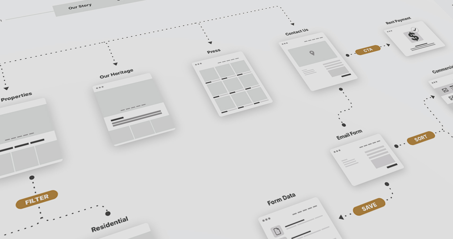
Since the original website was quite outdated, we did some work on the overall structure and organization of the content. This led to updating the brand architecture and foundation of the Udolf sitemap based on the new content.
Defining some styles and setting guidelines
Layout Grid System
We wanted the site to be responsive and felt that a 12 column with a 20 pt gutter would give us the flexibility we were looking for.

Typography
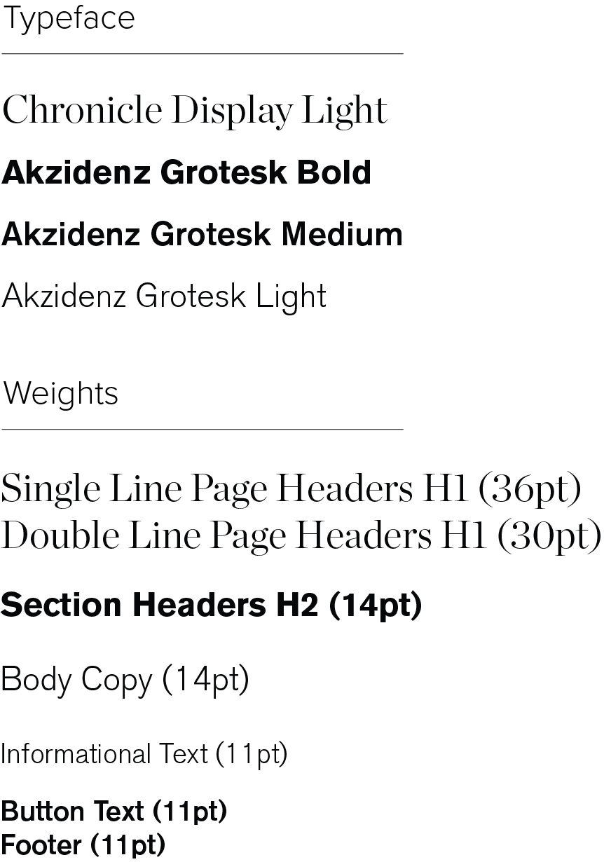
For the typefaces, we decided that we wanted to have a pairing of a serif and san-serif. We felt that Chronicle Display and Akzidenz Grotesk. The combination was a nice blend of modern and traditional which tied in nicely with our design approach for the website.
Chronicle Display Light
• Page Headers and Article Titles
Akzidens Grotesk Bold
• Navigation, Section Headers, Button Text, and Footer
Akzidens Grotesk Light
• Informational Text and Body Copy
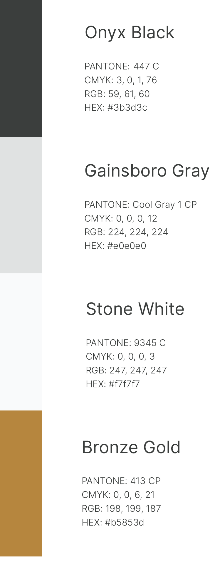
Colors and Accessibility
We checked that our color palette combinations at least AA compliant.
Compliance
Any combination of stone white, Gainsborough grey and onyx black passed the contrast requirements.
Default
White + Black = 10.44:1
Color Combinations
Gold + Black = 3.4:1 (only use with larger text 14pt bold or larger)
Gold + White = 3.1:1 (only use with larger text 14pt bold or larger)
Gold + Grey = not allowed
Grey + Black = 8.47:1
Grey + White = not allowed
Design Iterations
After spending some time on defining style, colors and guidelines, it was time for some creative explorations for Robert and his team.
Option one with color blocking at top.
Full width header image with horizontal title and Pegasus
Showing a layout based on grid system
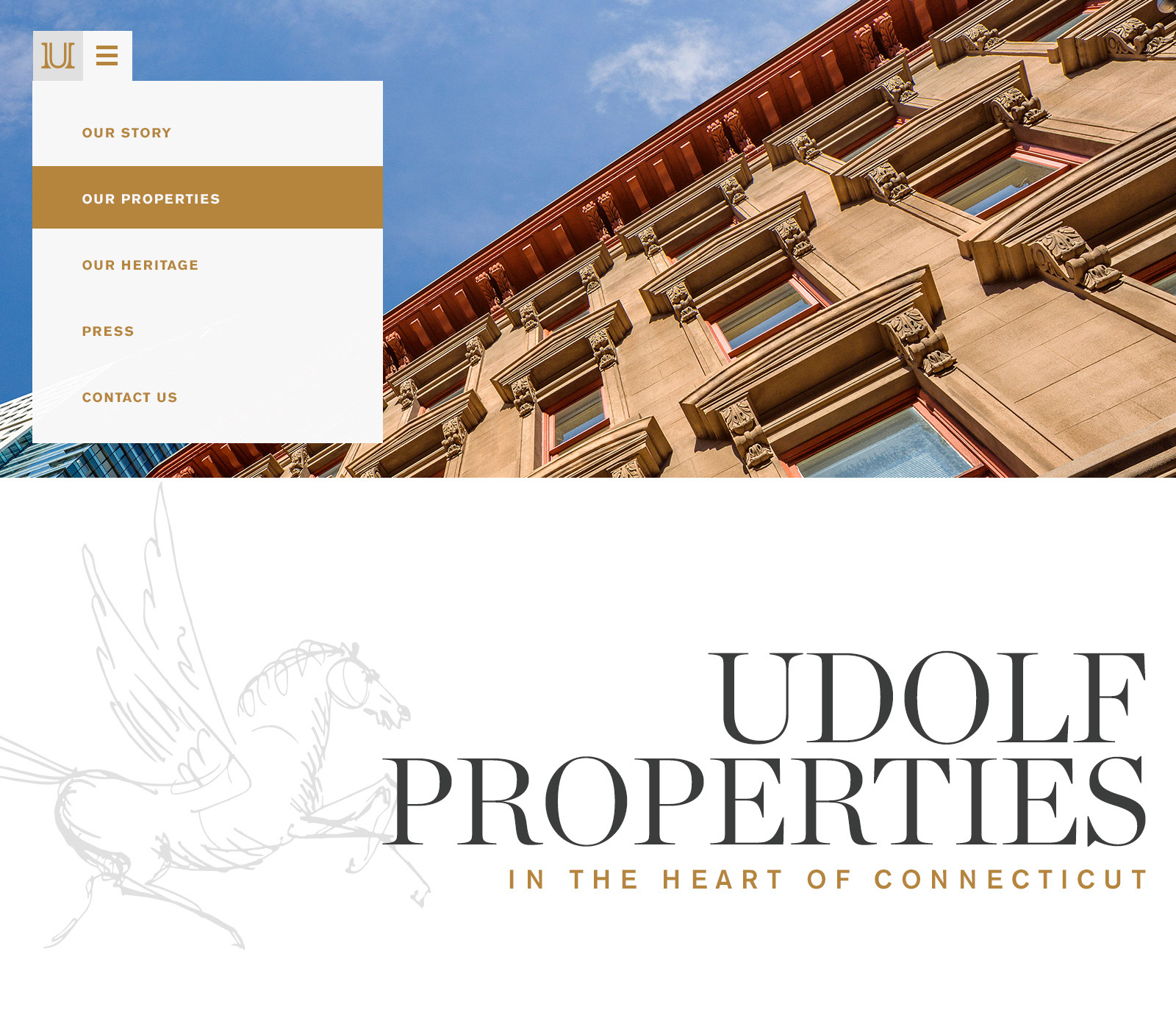
showing a collapsible hamburger menu
Transition sequence on Page Load
mid transition screen
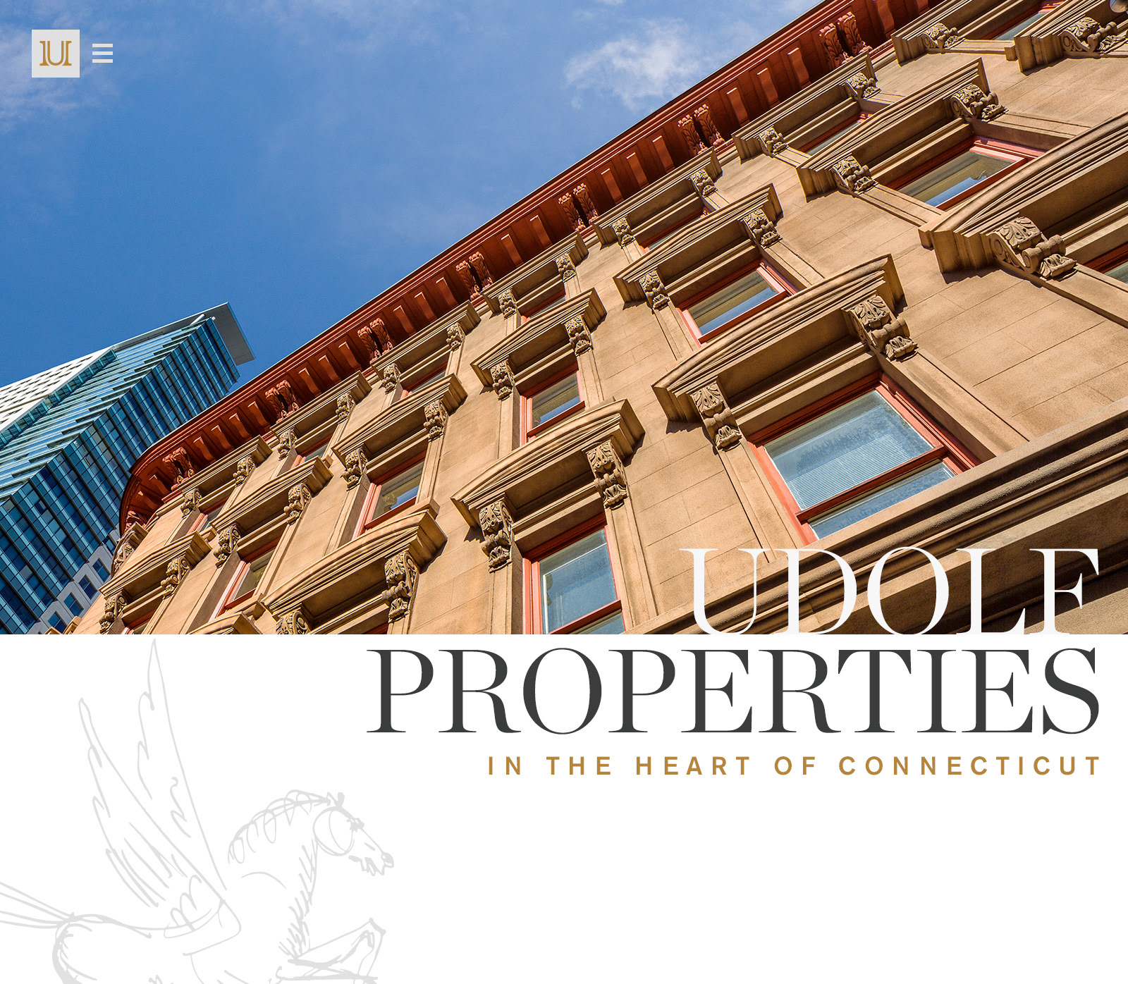
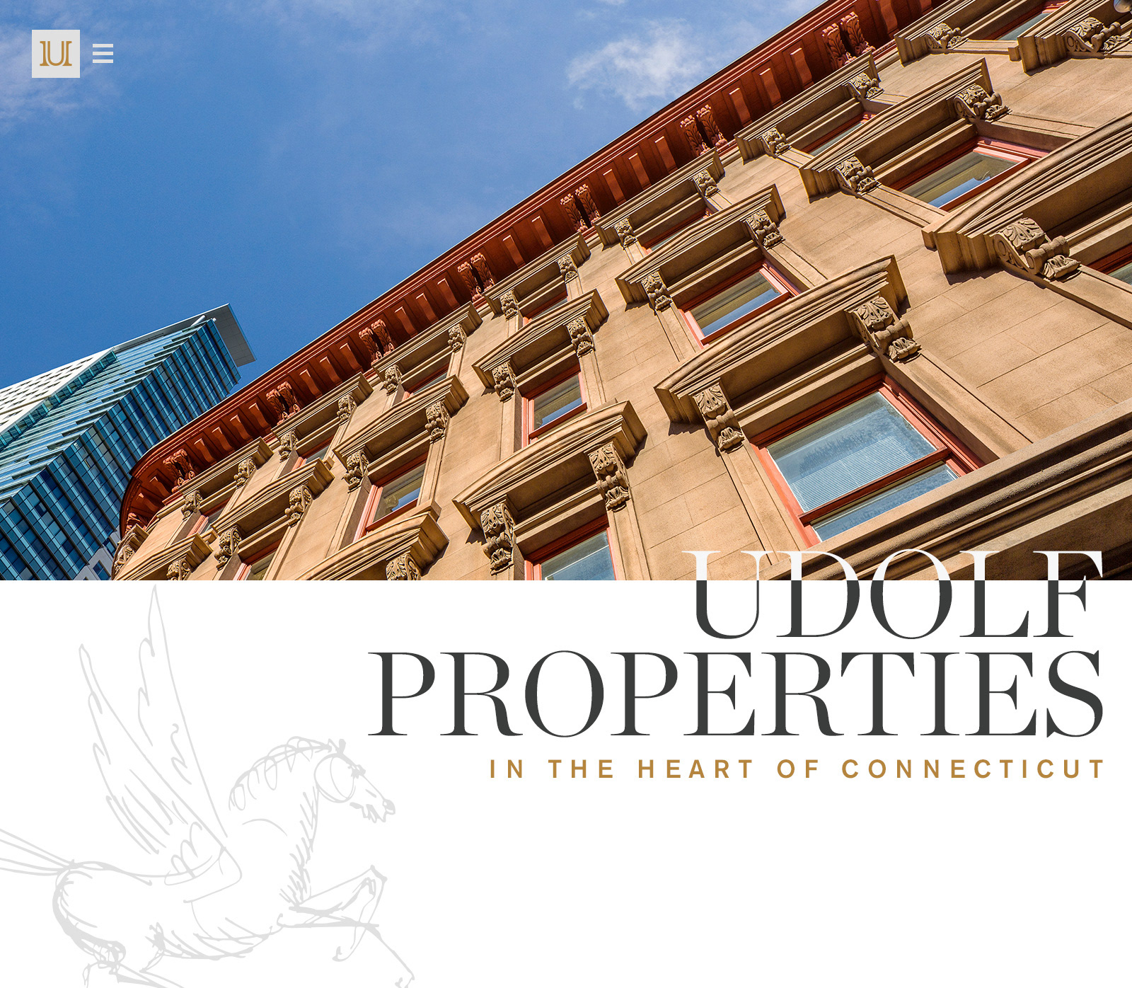
Final placement of Pegasus and Udolf Properties title
Final Creative Direction
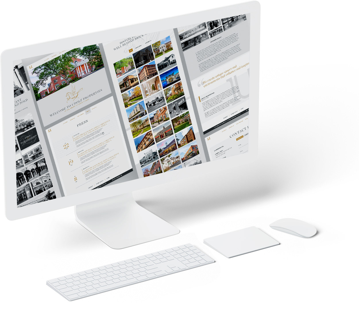
After a sitting with the client, we were able to define an overall creative direction based on a combination of the iterations. Once we were able to get the team's approval, I dug into the rest of the pages. Here's where we landed.
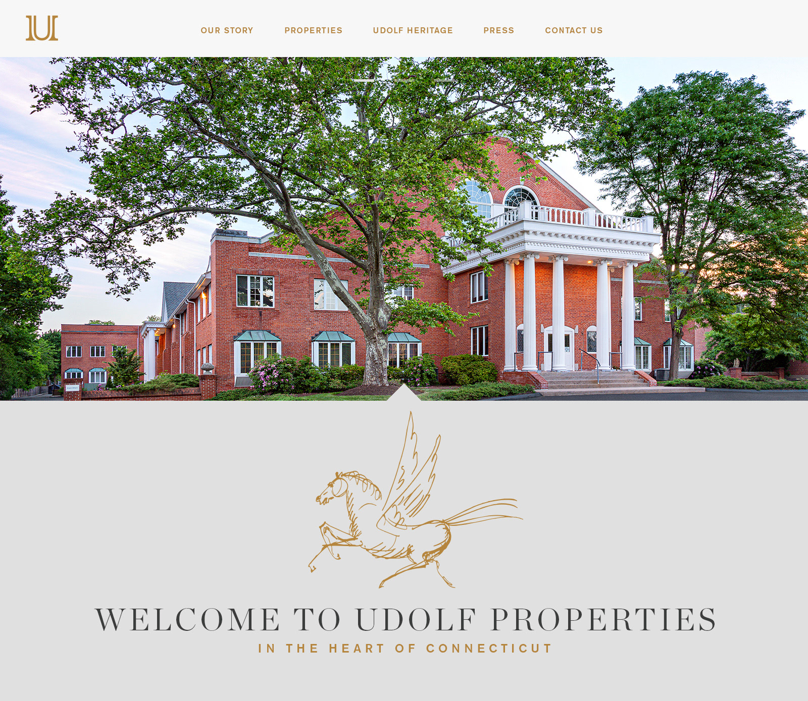
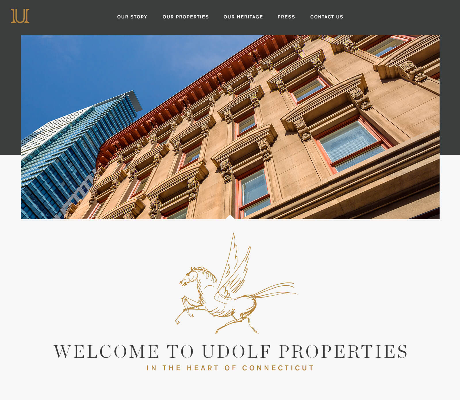
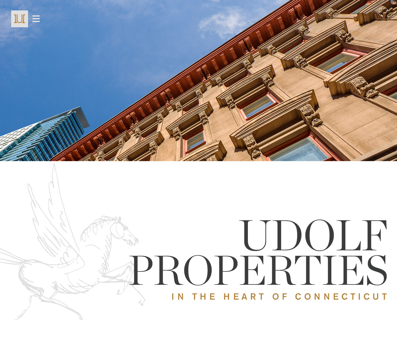
Landing Page with image header gallery (img 1)
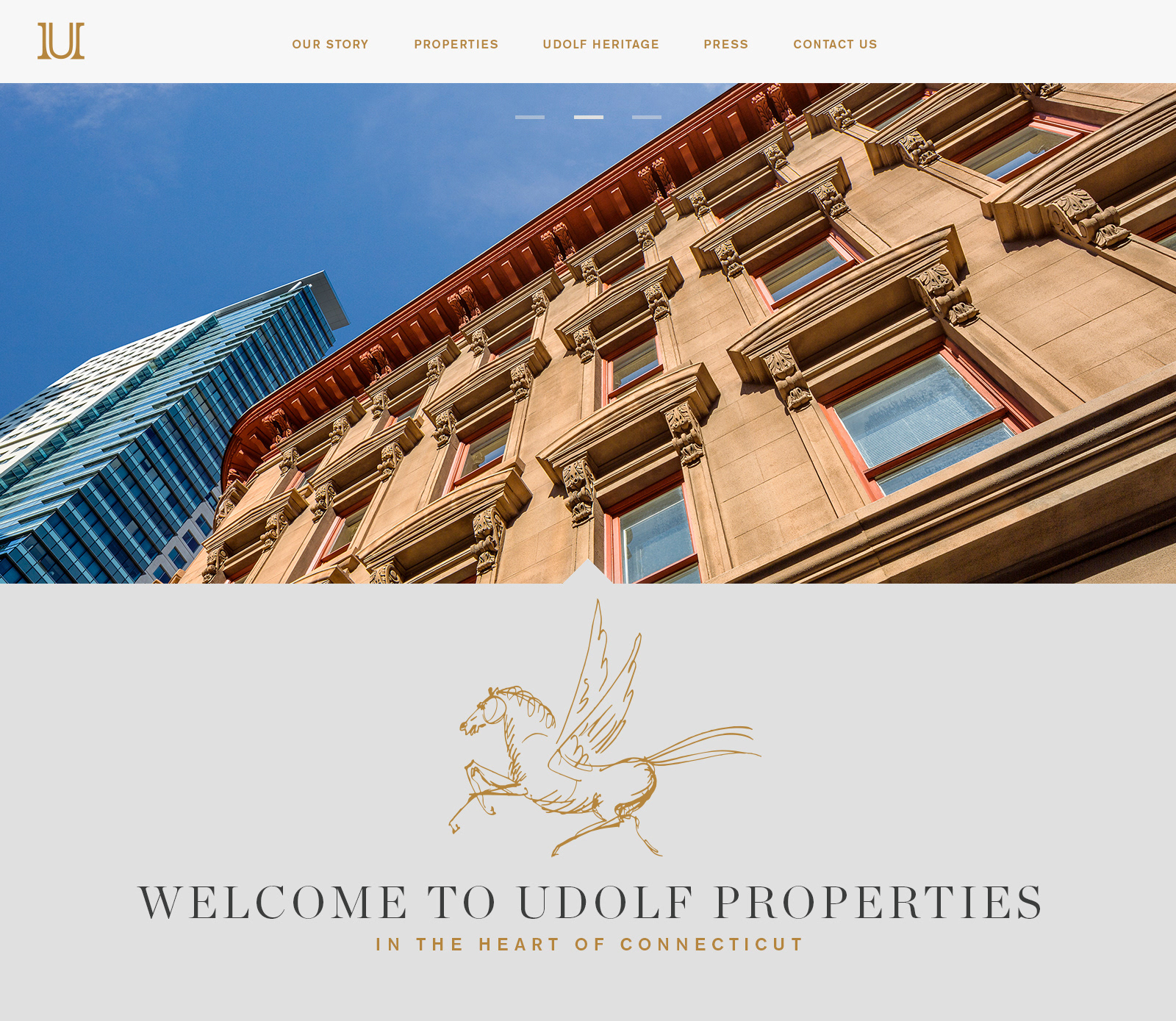
Landing Page with image header gallery (img 2)
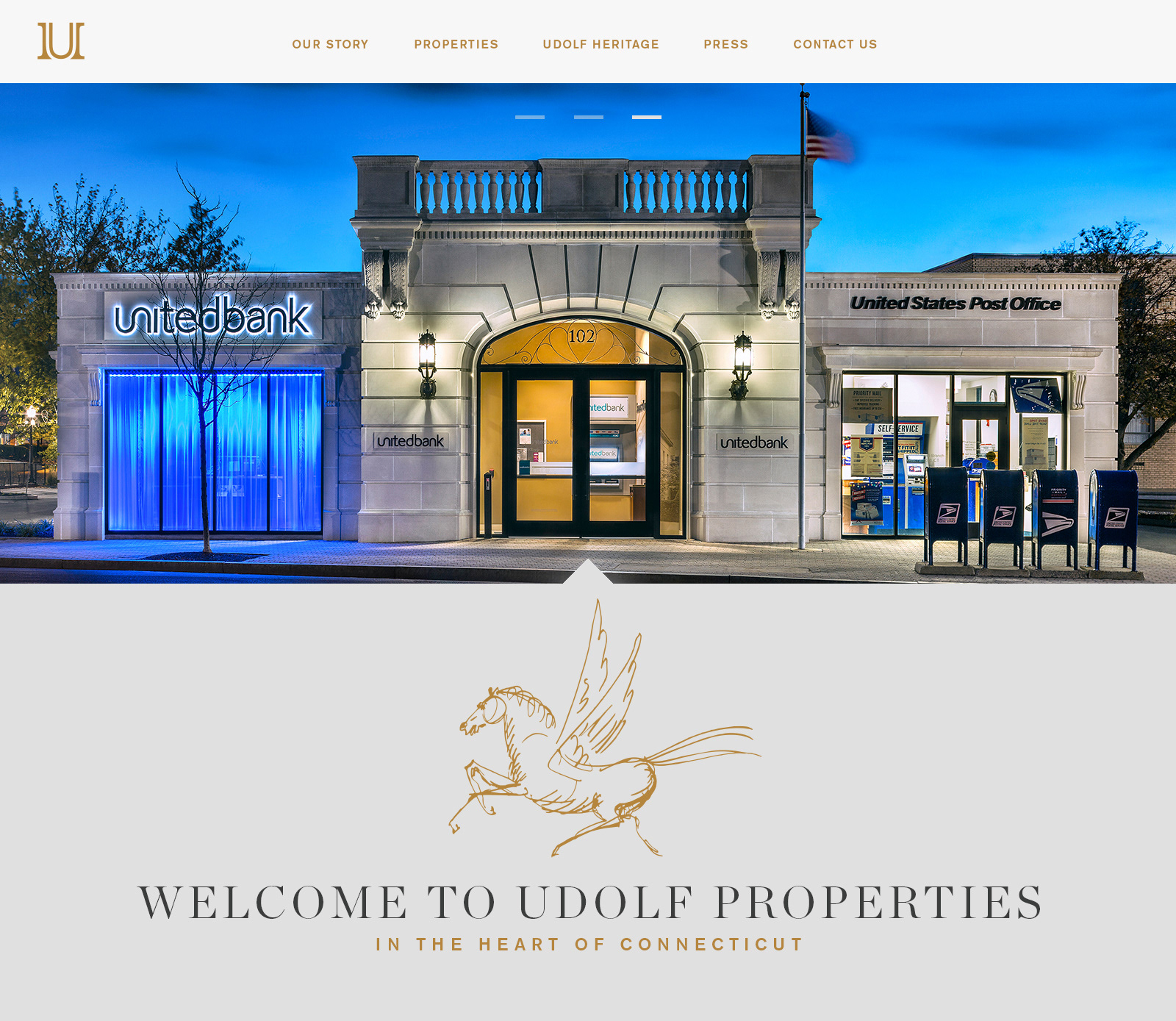
Landing Page with image header gallery (img 3)
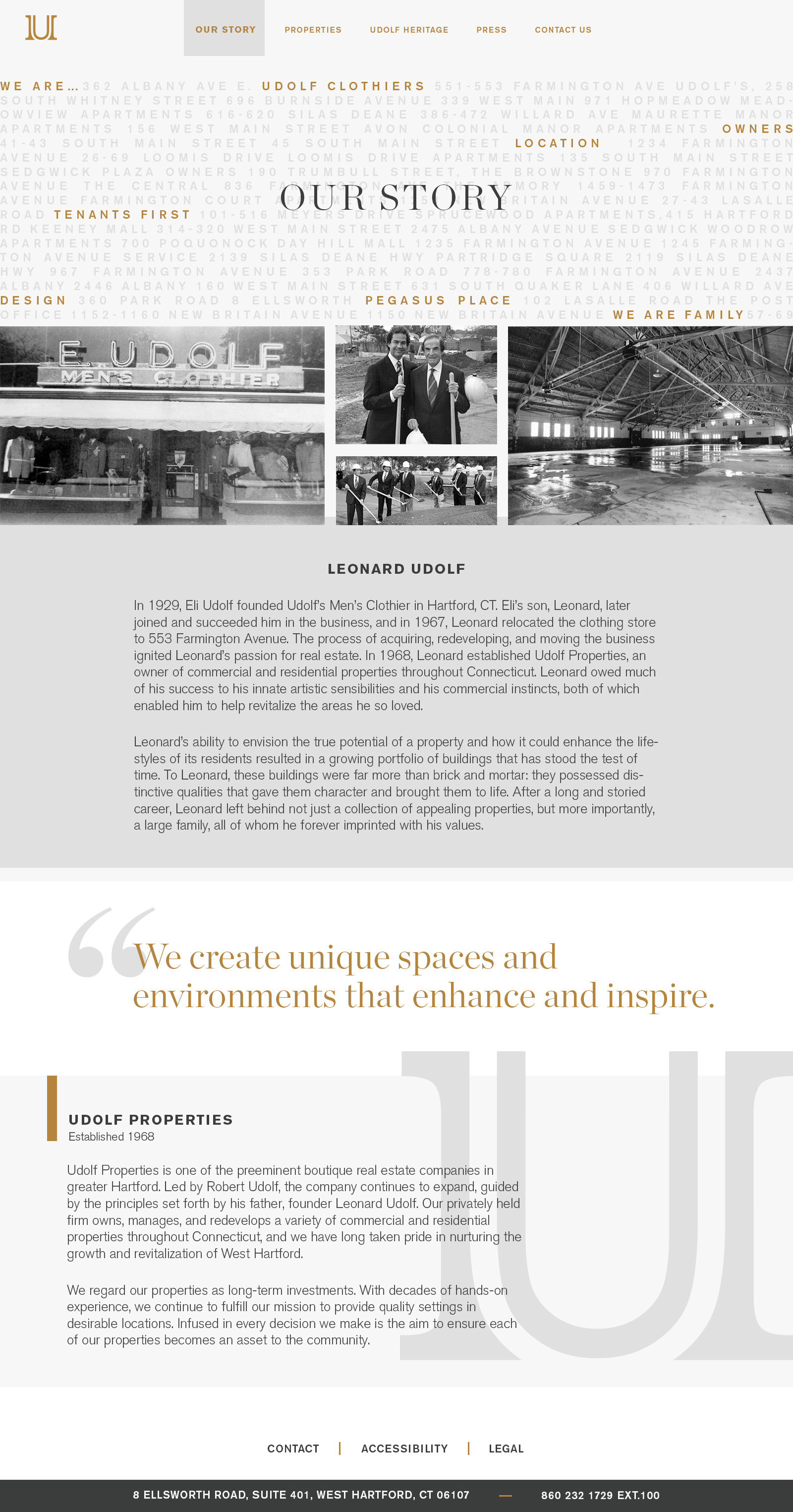
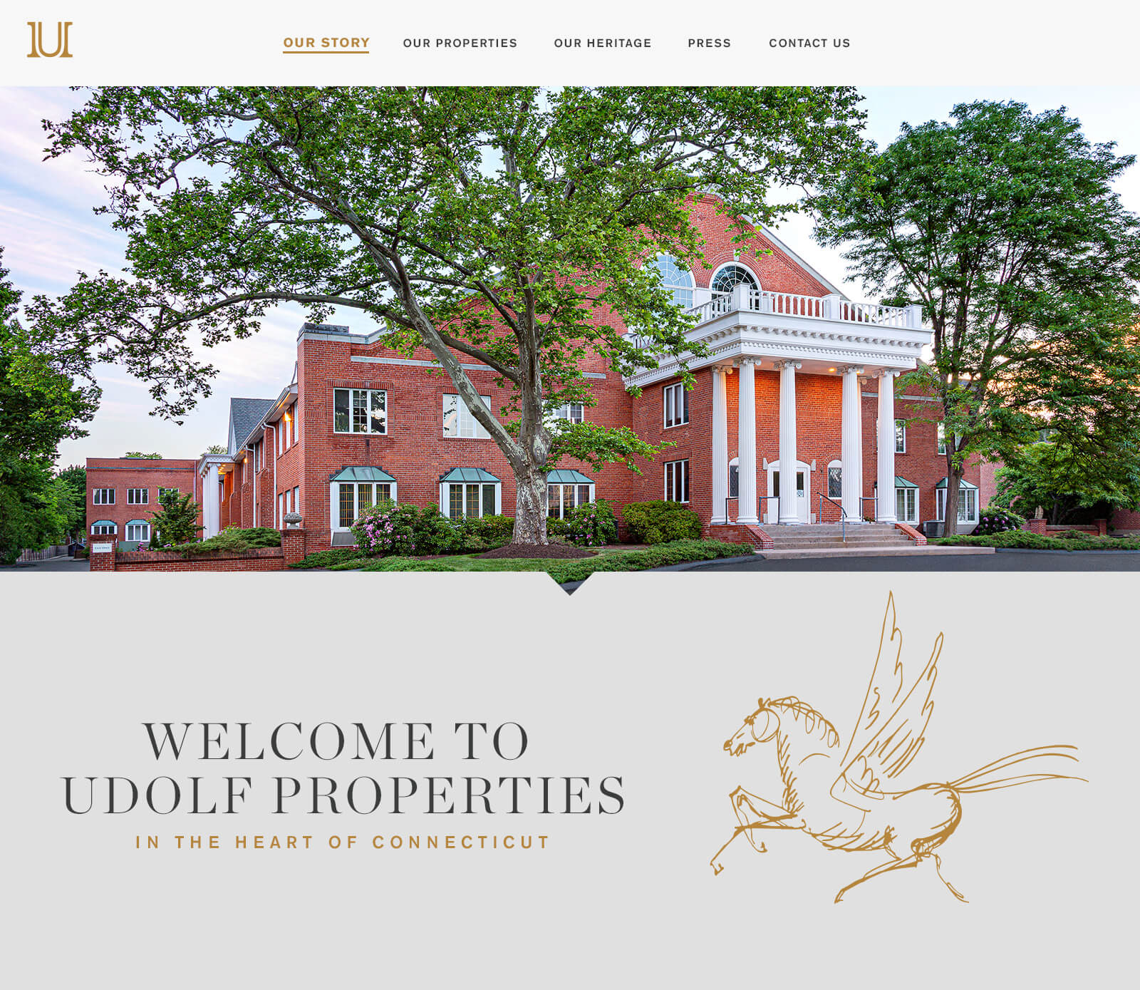
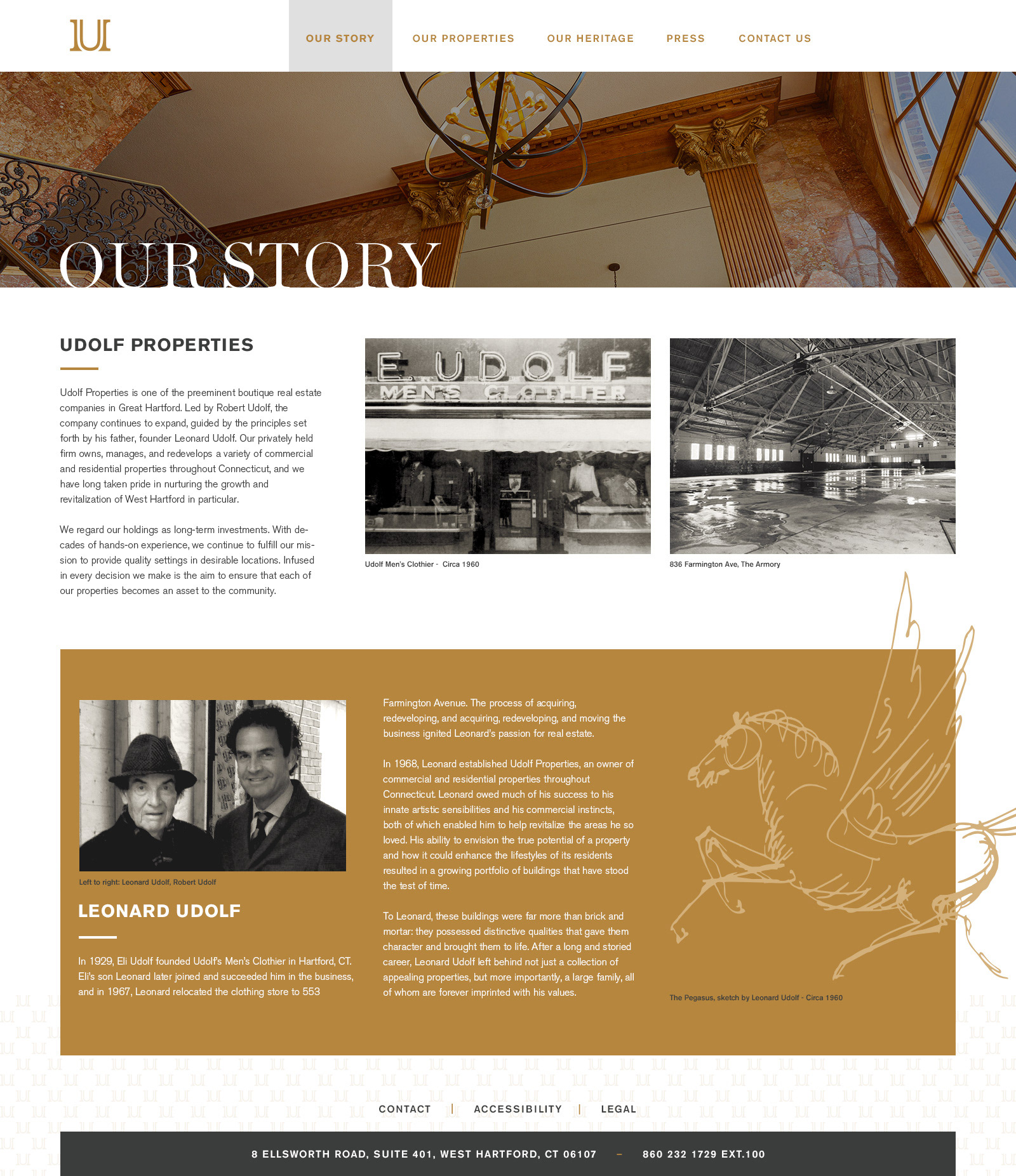
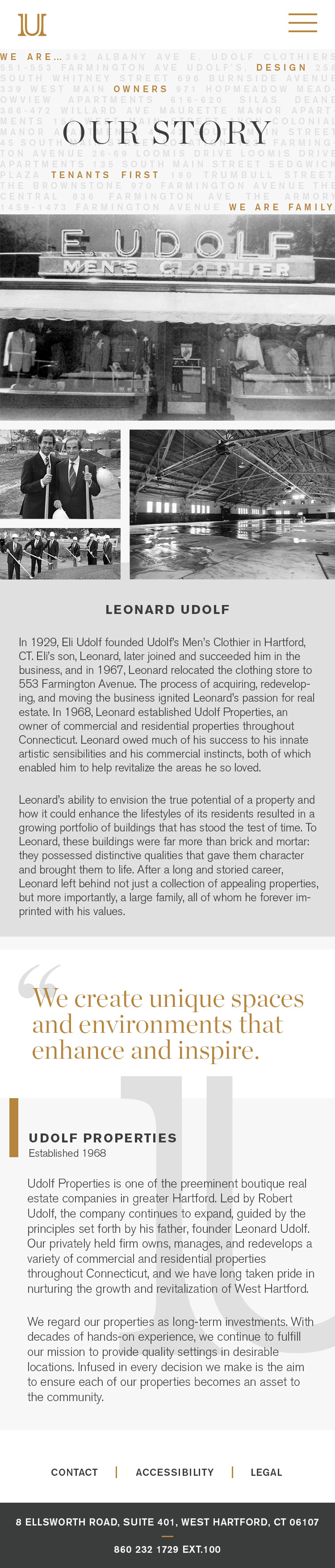
Our Story Page
Properties Page with ALL properties visible
Properties page with only Commercial images visible.
Properties page with only Residential properties visible.
Heritage page dedicated to past properties that Udolf Properties once owned and renovated; some of which have historical significance within the community.
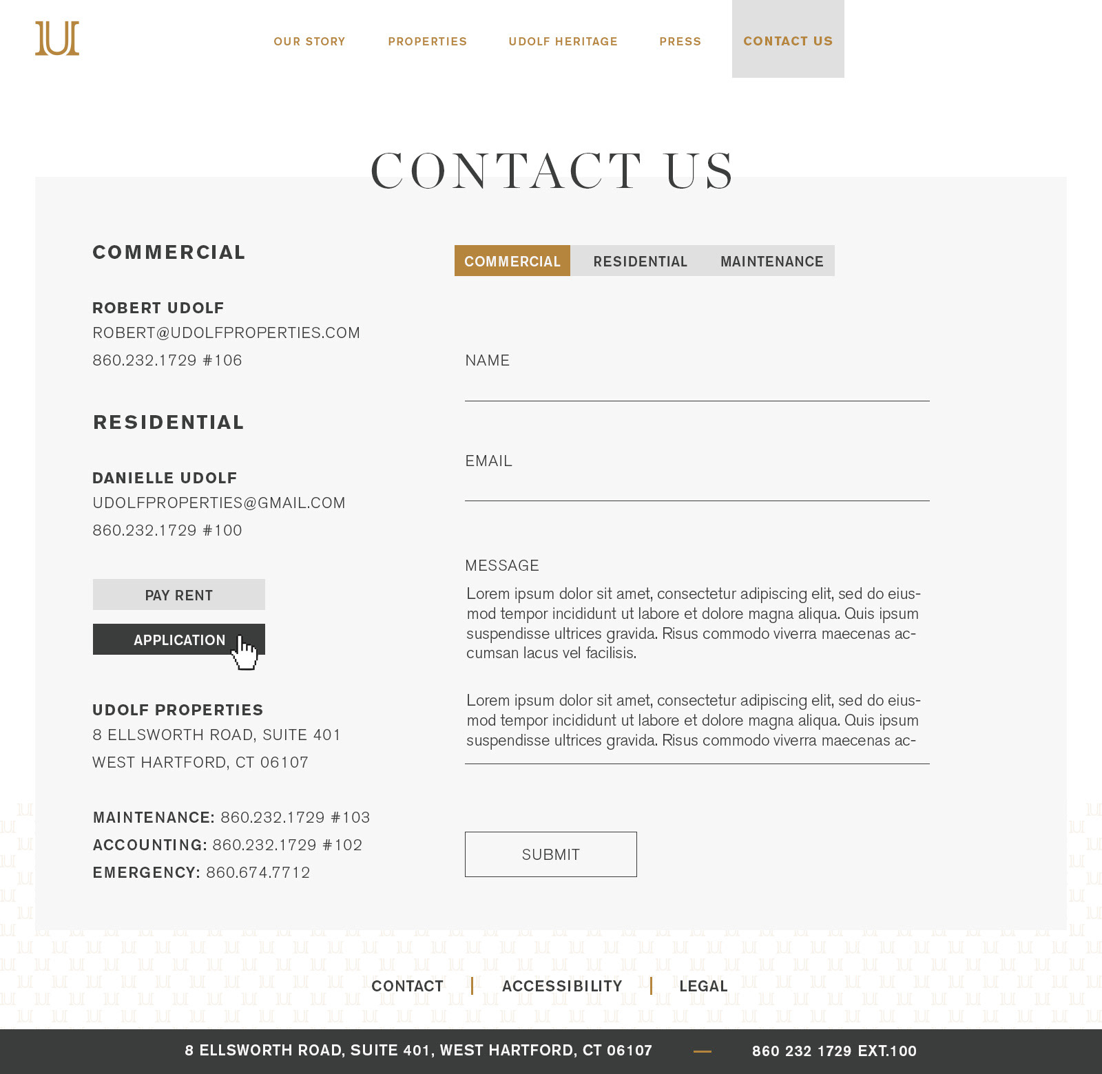
Contact form that will sort communication to the proper in box
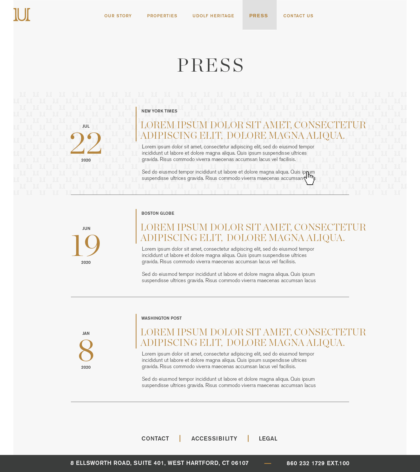
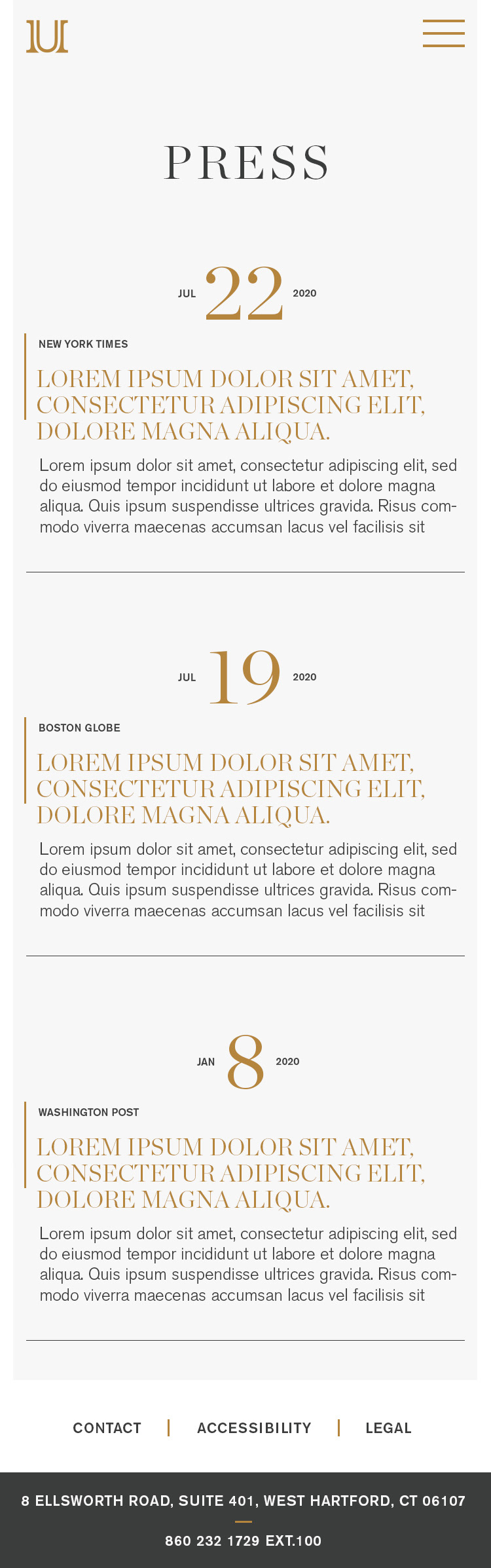
Press page where the user can view any article related to Udolf Properties
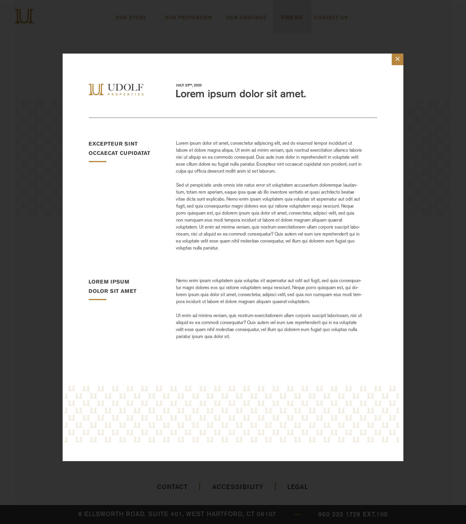
An example of article display layout once clicked in.
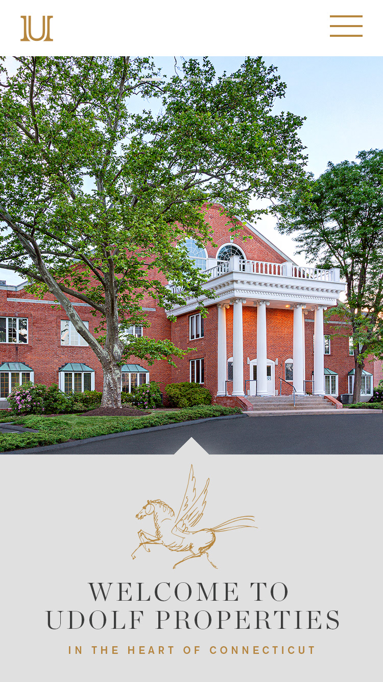
Mobile Layout for homepage
Mobile layout
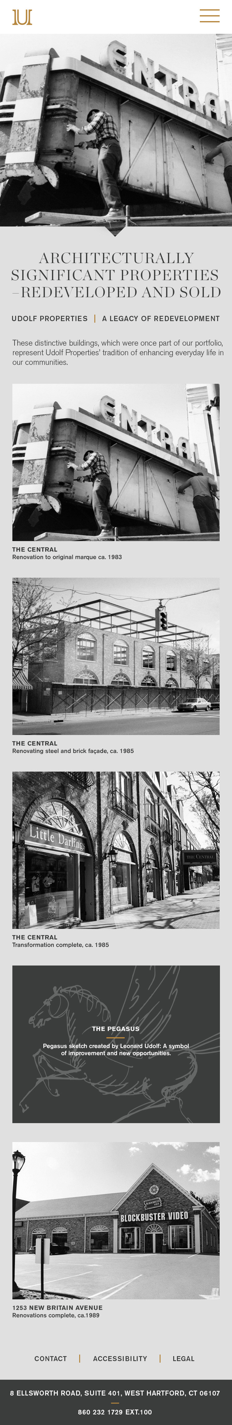
Mobile layout for heritage page