The Project
The ask was to simplify the CVS Extracare Loyalty experience. To also take a closer look at how customers interact with deals and rewards to see how we can improve engagement and ultimately conversion.
Customer Pain points
"...It's almost like getting a homework assignment or another chore to do..."
Our customers are frustrated with the current experience of finding deals for products they buy.
• This is especially true for our customers that try to plan their CVS visit ahead of time.
• Confusing and time consuming to find relevant deals, weekly offers and qualifying products.
• Overwhelming at times due to the sheer amount and variety of coupons in the feed.
The goal
From the user experience perspective, our goal was to become a better partner in our customer's savings journey. We felt that by simplifying the searching for deals and pairing them with relevant products, this would improve the overall experience within Loyalty.
Known risks
We knew that this project was going to be high pressure and high visibility. The ExtraCare program has been a cornerstone of CVS for over 20 years with over 74 million members; and we were about to make changes to it. Our executive leadership team agreed that the company needed to improve the experience but was very much anchored in a "do no harm" position.
In addition to this, we had an extremely tight deadline to deliver final high fidelity work in responsive web, iOS and Android. Within our time frame, we needed to conduct and review research, create a point of view, validate our direction, get alignment in all phases of design and hand off polished annotated designs over to our engineering team.
The plan
Pull aggregated research, conduct new research to inform and validate the new direction. Create synergy throughout the retail funnel of our customer journey. Share early and often with stakeholders.
Diving into the data
We were fortunate in that we knew a lot about our customer habits and complaints. With the program being in market for so long, there was plenty of data for us to leverage. We combined those relevant points with market research and some competitive analysis to formulate our point of view on simplifying the loyalty experience.
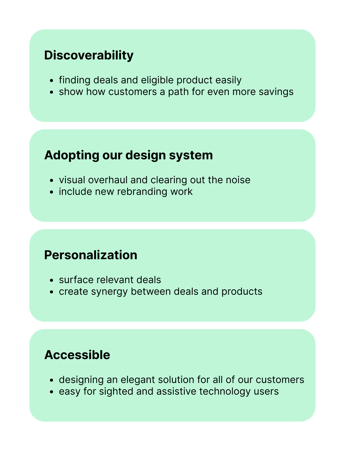
Based on our findings we landed on four core themes that blended business and UX motivations for the work.
Discoverability - How do we bring our deals closer to the products and reduce searching? How can we educate our customers on more ways to save? How can we entice the customer to stay engaged and shop more?
Design system - We needed to clean up the information overload and densely packed experience while still being informative and intuitive. We also wanted to infuse our brand dna throughout the experience.
Personalization - How can we better help our customers see what they want to see in their CVS digital experience?
Accessible - How can we be more inclusive in our design and implementation to make this experience more enjoyable for all of our current and future customers?
Deciding on a direction
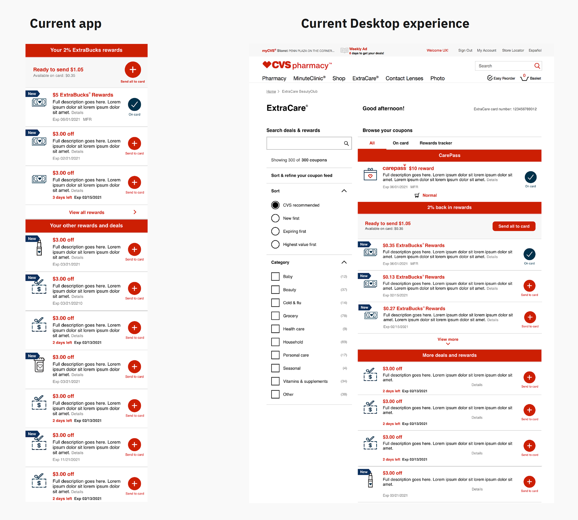
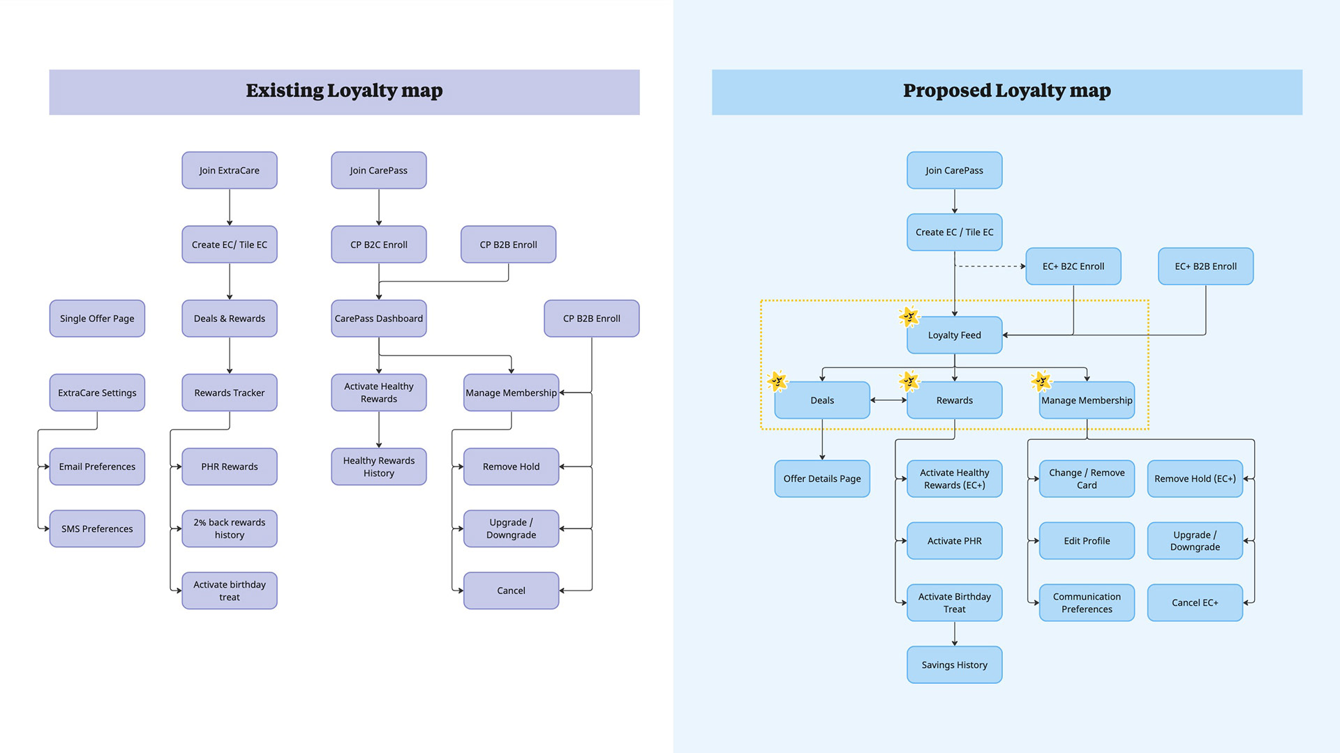
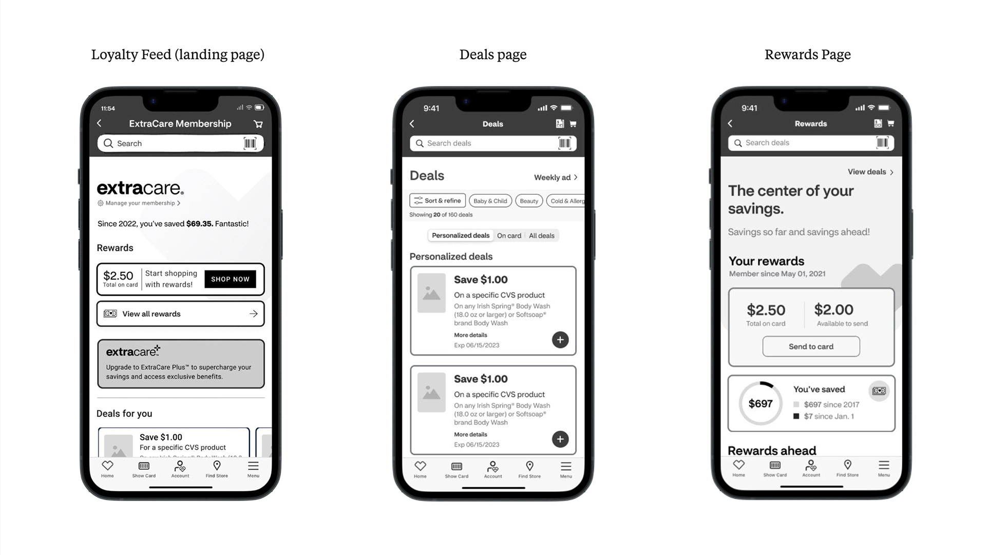
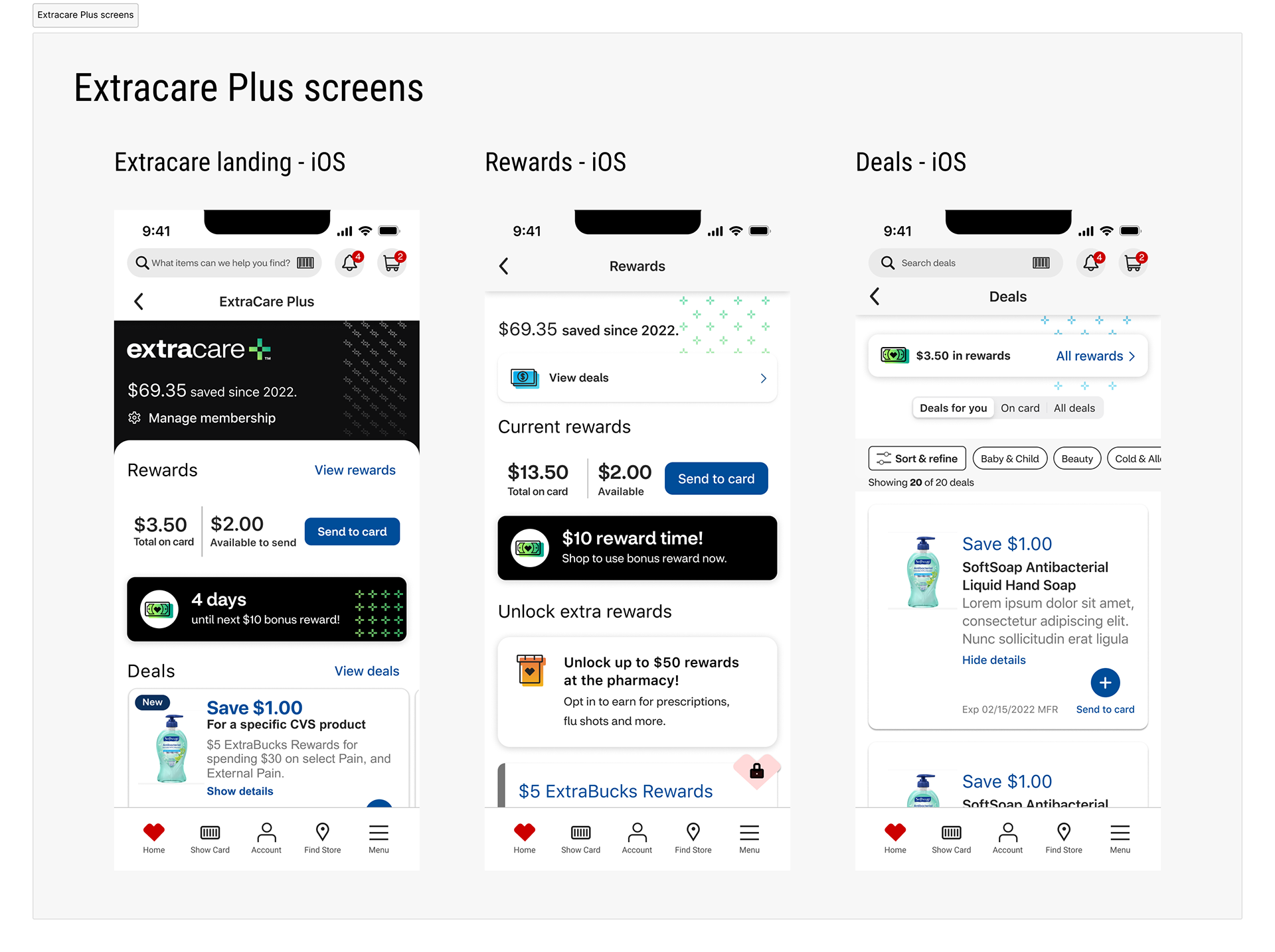
It became clear to us that we needed to separate the current deals & rewards feed. The single feed was too overwhelming and didn't offer much opportunity for enhancement without introducing more content in an already saturated page. We landed on replacing the feed with three net new pages, a landing page, one page dedicated to deals, and another dedicated to rewards. This would offer us the opportunity of focus and also enable us to enhance each experience based on what our customer wanted to explore at that moment.
Our proposed ecosystem consolidated the existing 22 pages down to 19 while assembling all core loyalty tasks into 4 main interconnected pages.
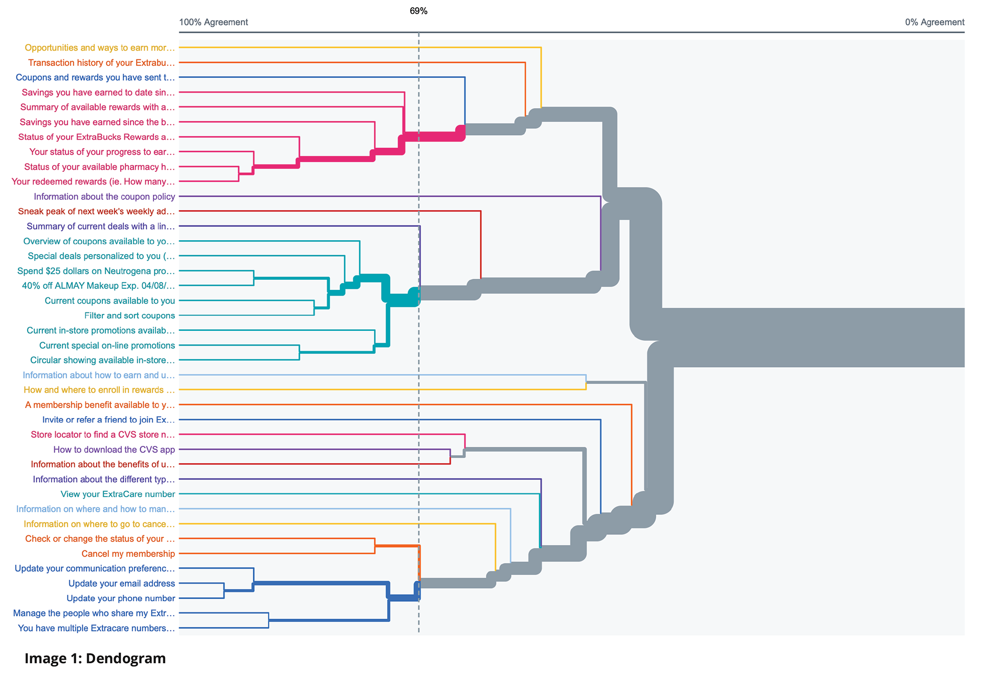
Validating our direction
We worked closely with our in house UXR partners to structure our testing plan throughout the Program Increment (PI). We started off with a closed card sorting study followed by some tree testing. The primary goal of this research was to understand users' mental models and expectations around the proposed taxonomy for a combined loyalty experience. We asked our testers to complete navigational tasks that were typical in this loyalty space.
The results of these tests indicated we were on the right path. We had a moderate to high success rate in navigating the proposed tasks. This essentially laid a solid foundation for our base design work.
From here, we could move into lo-fi design work. We had also planned to follow this lo-fi and mid-fi work with some moderated testing to allow us the opportunity to course correct or enhance the experience based on customer feedback.
Lo-fi, mid-fi, and more testing
With our taxonomy and site organizational structure in place, we quickly dove into to concepting in lo-fi. We explored a few different approaches to content layout that we felt addressed our core themes. Once we settled on a layout and had collective agreement from our stakeholders, we refined our lo-fi screens into mid-fi and created a prototype in preparation for another round of user testing.
Our findings
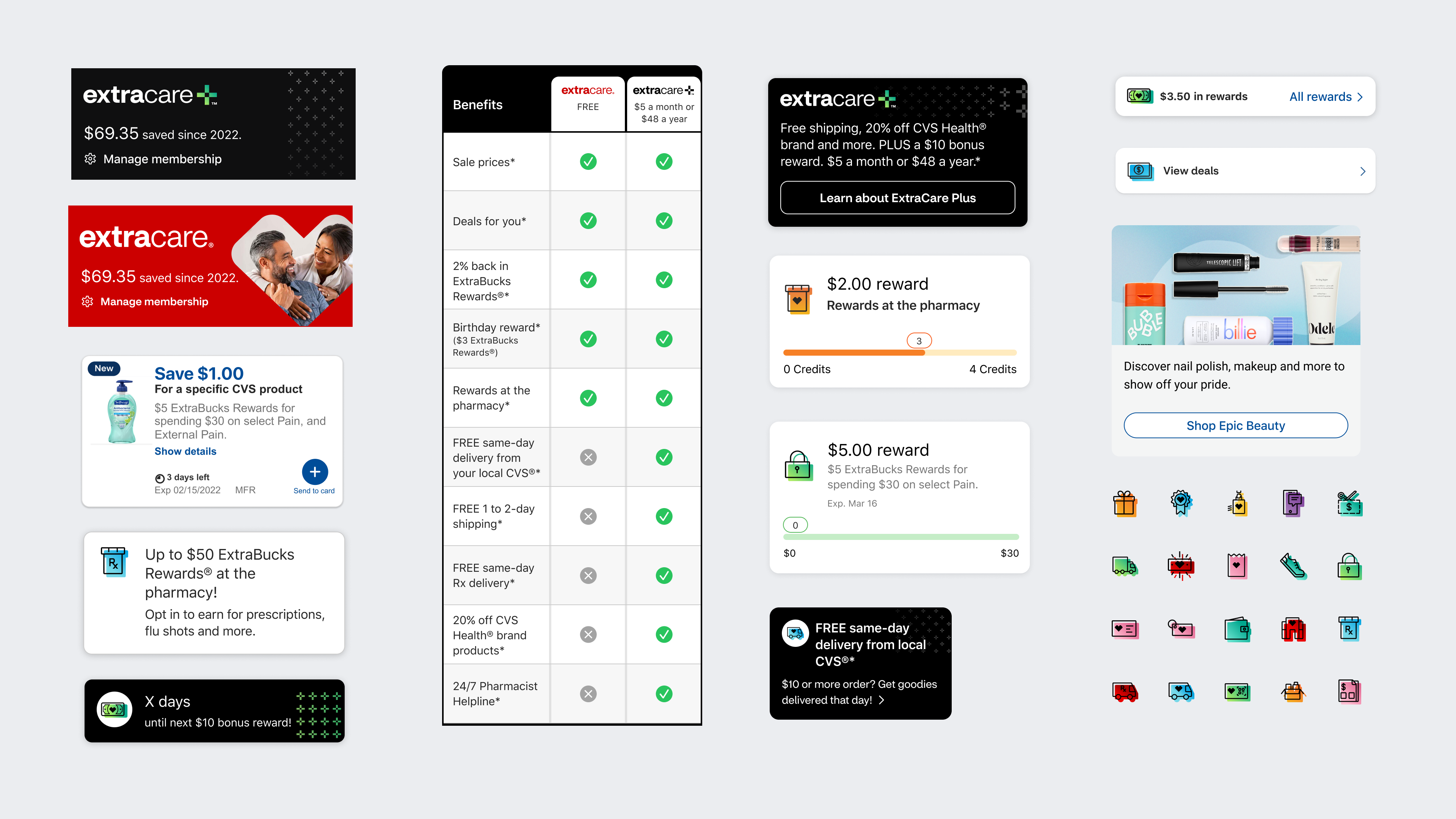
We had conducted six moderated sessions with our prototype. The sessions were about an hour each. We learned so much during that time. Overall the general feedback was very positive. Users liked and saw value in the landing page as an overview of their benefits. Five of the six users really liked the separation of their rewards from deals. And all users responded very well to the personalization with deals, assuming that it was based on their relevant shopping habits.
We also came away with some great actionable improvements we could make to the experience. A couple of examples were; users didn't initially see value in the next best action tile (Extracare+ upgrade) but did like the membership side by side comparison at the bottom of the Loyalty feed. For the Rewards page, they didn't initially understand the purpose of the "Rewards ahead" section.
With the recommendations from our analysis, we were ready to make changes to the layouts and begin incorporating user interface (UI) elements.
Creative alignment
In conjunction with our team's task to deliver the new loyalty experience, our brand team was actively working in parallel on a rebrand effort for Extracare. A focus of that work was a name change from CarePass to Extracare Plus. It was crucial that we stayed closely connected throughout the stages of design. We shared often and iterated through many design layouts.
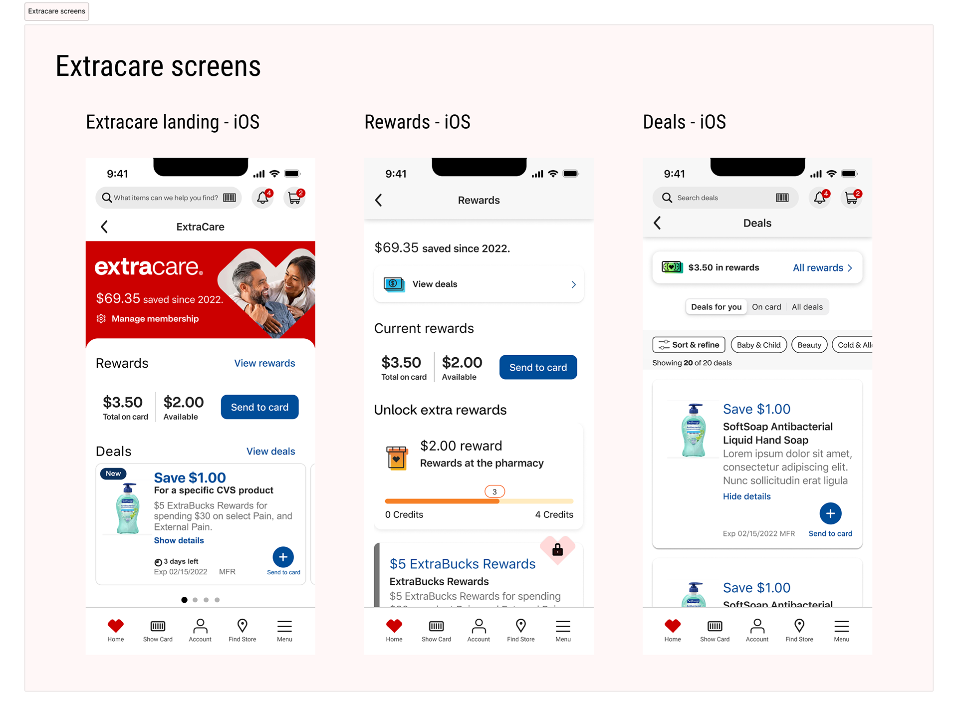
Hand off
It was a sizable undertaking to hand off the three main screens along with the various scenarios across native iOS, Android and responsive web. Through cross team collaboration, support and regular communication; we were successful in getting sign off from all of our stakeholders which included: Product, Development, Content, Accessibility, Design systems, Brand and Executive leadership. In the end, we were able to meet our deadline in delivering fully annotated designs for the simplified Extracare loyalty experience that we could all be proud of.