The Project
Redesign CVS coupons to adopt the new visual design language being created along with addressing some customer feedback.
Customer behavior
Our customers typically engage with CVS through the loyalty program when preparing for a shopping session. Deals and Rewards essentially is the starting point for most customers in their journey to saving money with CVS.
The problem
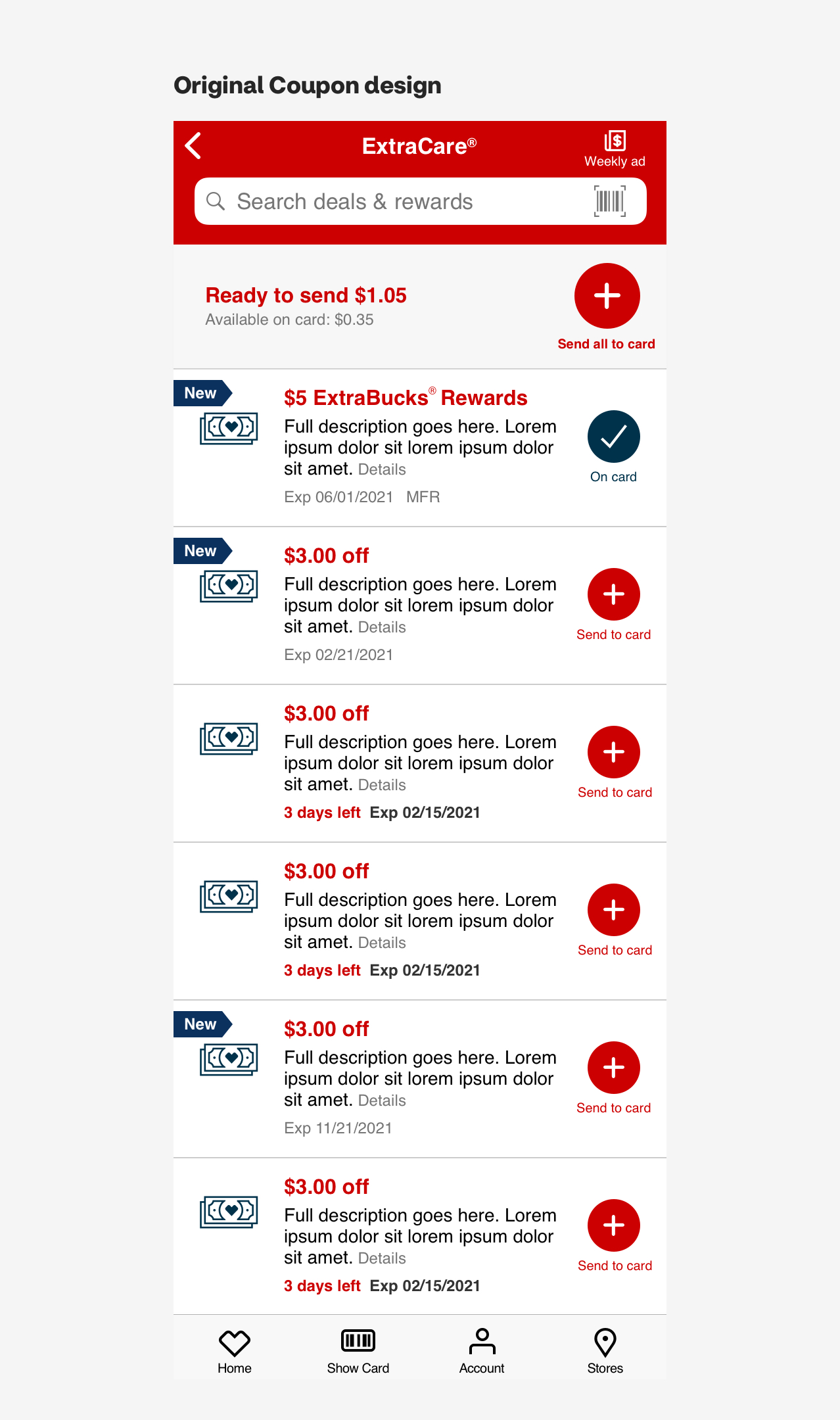
Customers were feeling overwhelmed with the amount information being shown. Also the the sheer number of deals and rewards that customers had to look through made their search for relevant products quite time consuming.
Requirements
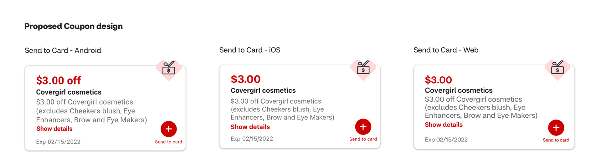
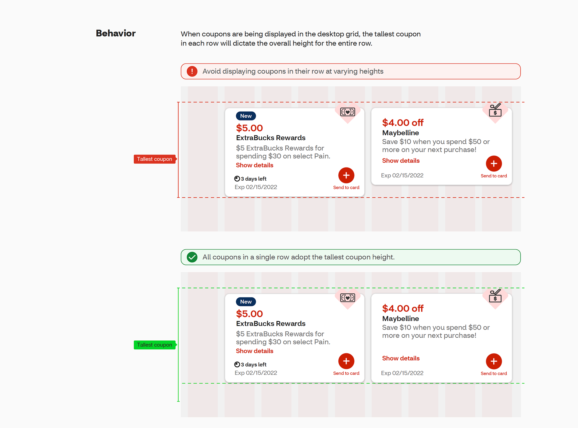
The ask was to look at the existing coupon functionality and enhance the UI with our Pulse design system. We also needed to address the hierarchy of information within the coupon itself. In addition, there were some elements that were off limits in terms of the redesign which included the Send to Card and On Card button.
Exploration
The process started with some competitive analysis, followed by some design exploration. Once we settled on a design direction as a team, it was time for us to validate our designs. We had done this through some unmoderated user testing.
Deliverables
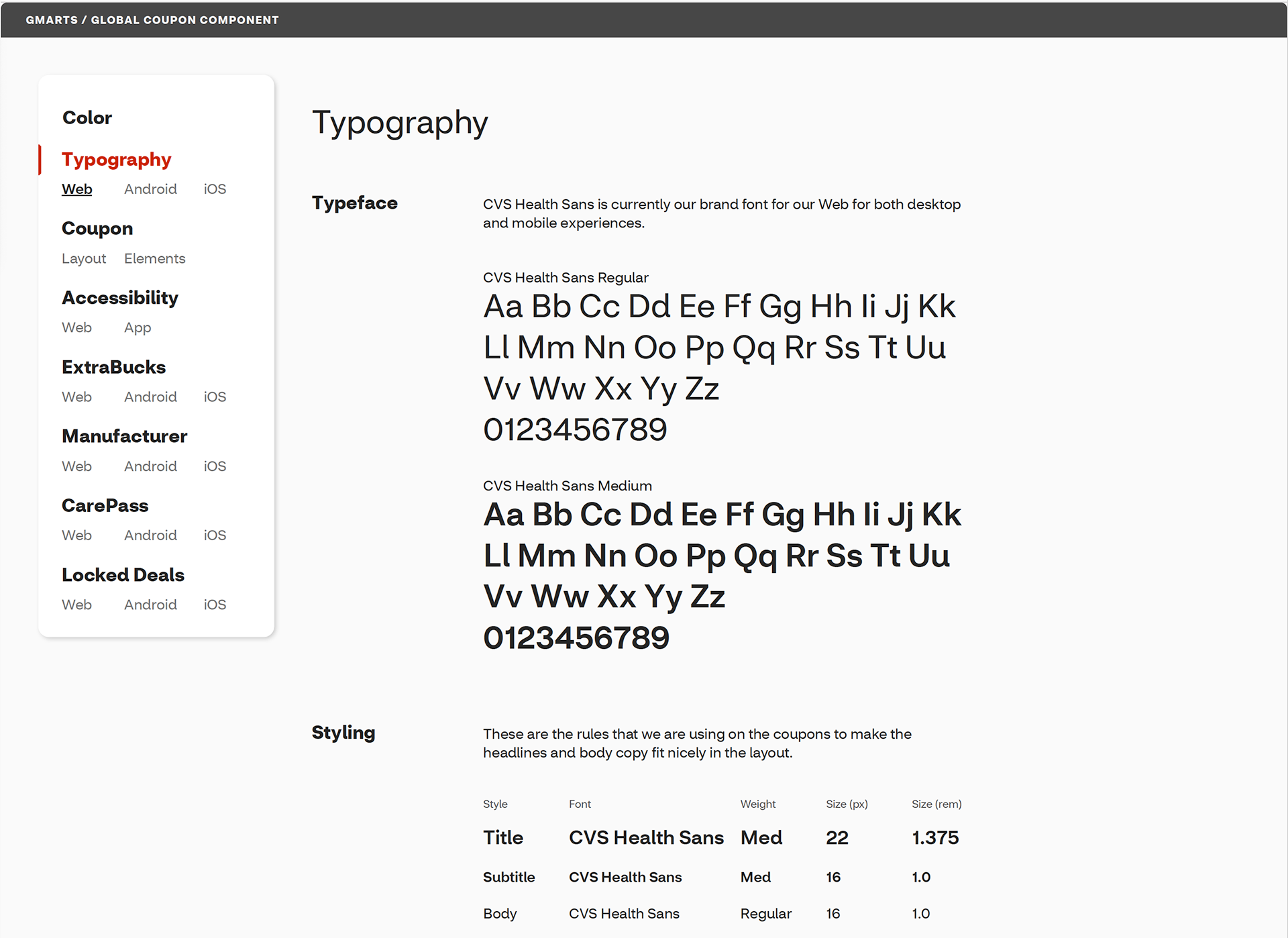
We wanted to support native typography, so we delivered three versions of the design to include native font support for Android and iOS along with our brand typeface for web. In addition, detailed documentation was created to help our dev partners to ensure design to code parity.
Documentation
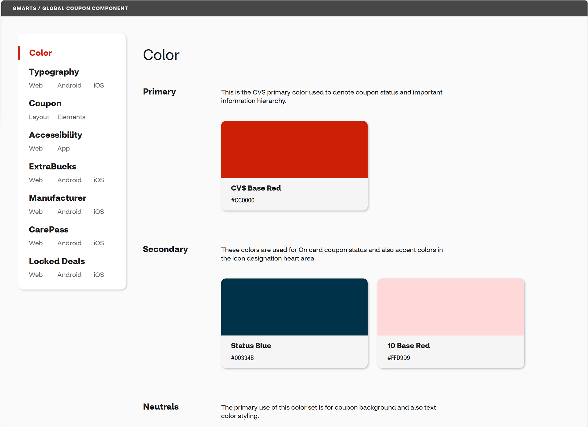
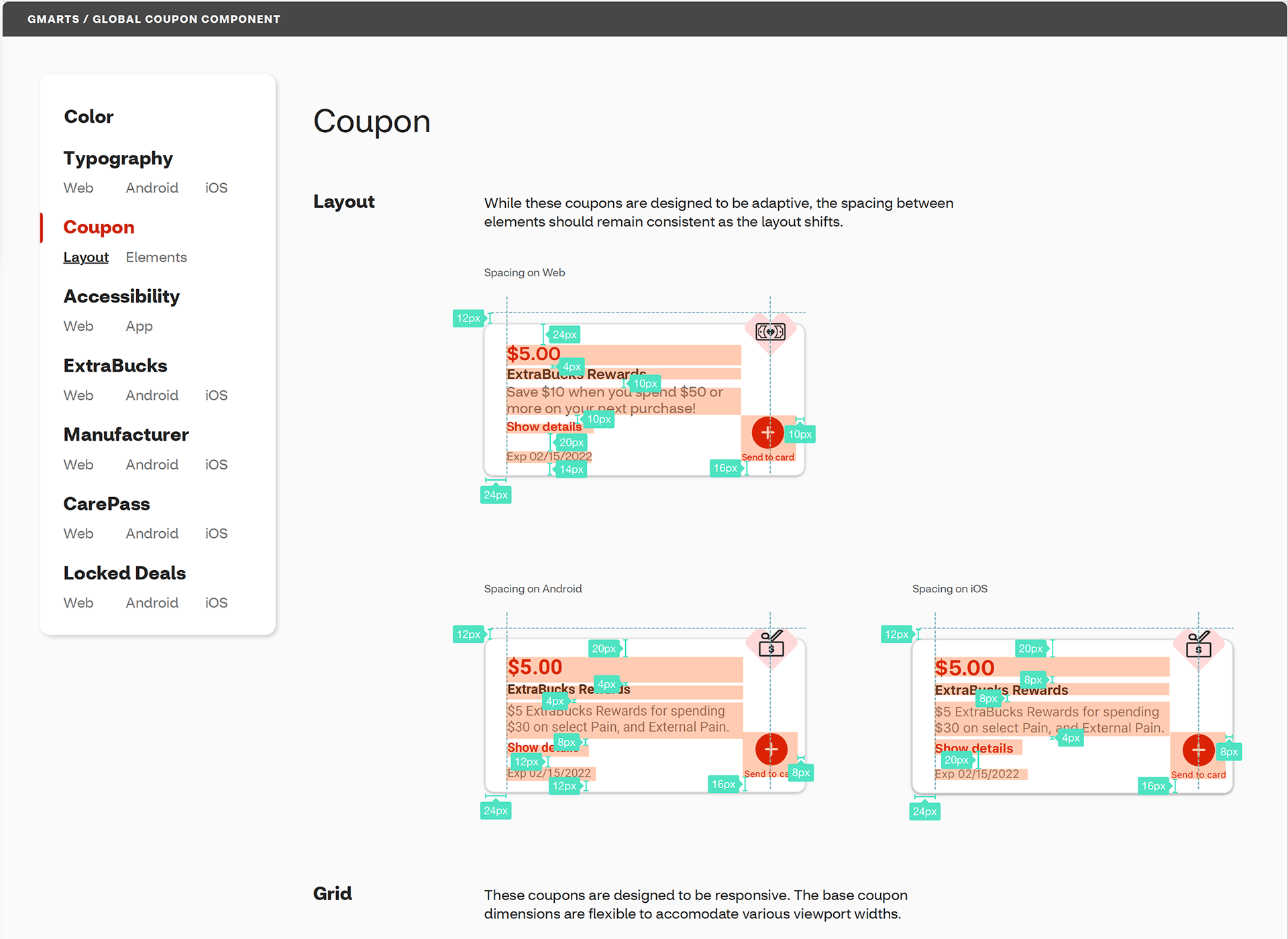
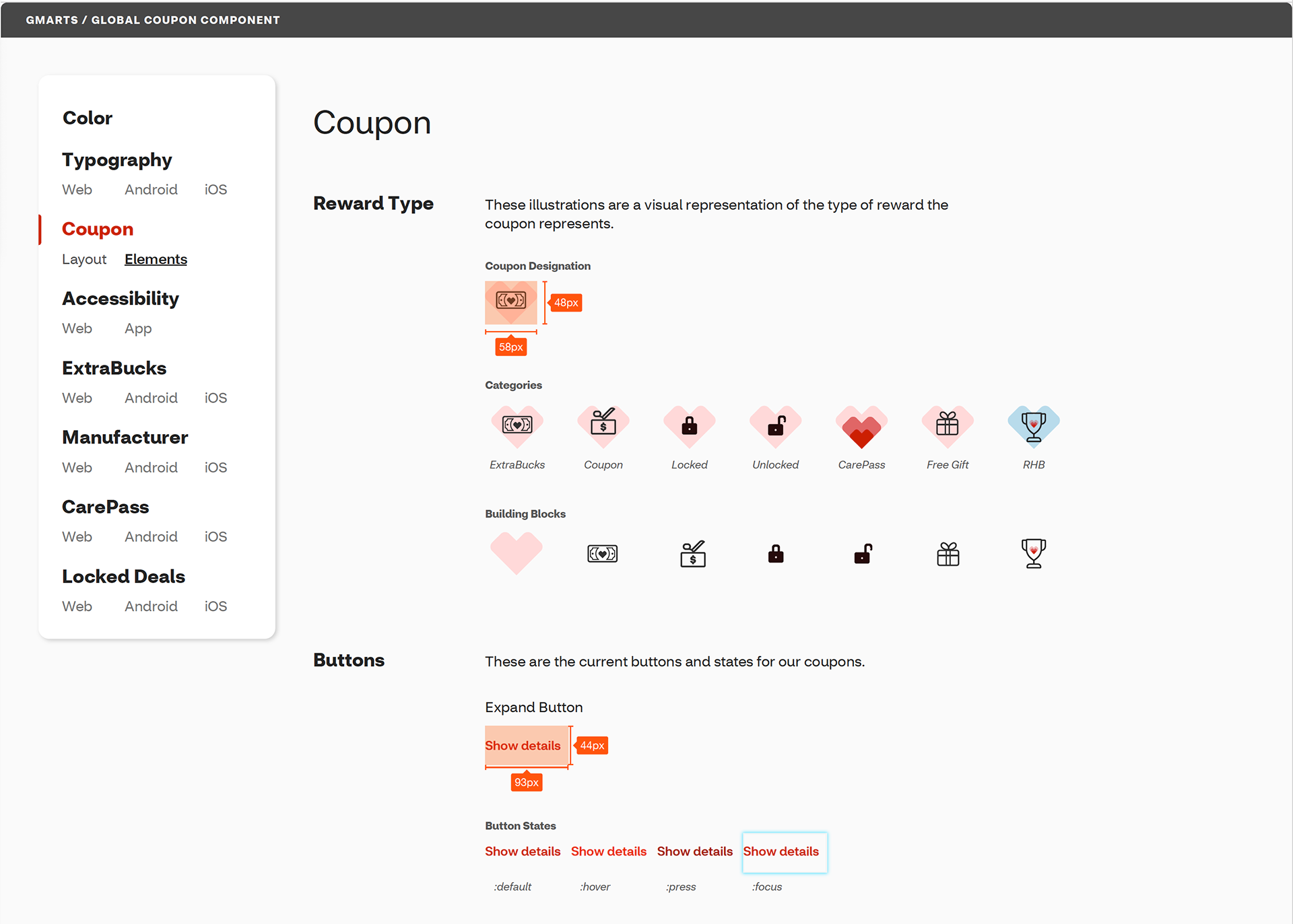
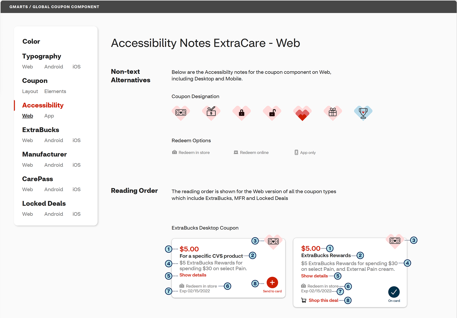
Prior to creating this documentation, it was difficult to get the full picture in terms of use cases, requirements, design specs and such. Information was scattered across several repositories and applications such as sharePoint, Miro, multiple Sketch files, word docs and powerPoints. This mini design system and style guide brought all of that information into one place. It became a great source for onboarding new designers or devs that would be working in the Loyalty space or for anyone that needed a quick reference. It covered various relevant topics such as: building blocks of the design language, design specs, coupon scenarios, layout specs based on device and use cases, accessibility, coupon mapping of data and more.
In many ways the documentation became the larger piece that expanded beyond the hand off. I continually maintained the content based on conversations with various capabilities. My intention was to create a single source of truth space for design and dev. This came to life as an interactive prototype that lived on InVision, then later migrated to Figma. Anyone that was working on coupons could jump over to the documentation and jump to the relevant info they were looking for.
Outcome
The feedback from testing prior to launch was overwhelmingly positive to the new design direction. Customers felt that coupons were more easily scannable and visually appealing. Now that the new coupon design has been in market for some time, the sentiment continues to be positive.
Takeaways
I learned so much from this project. The CVS loyalty program is deep and complicated. I came out understanding how important savings are to our customers and how integral these coupons are to CVS engagement. I feel that I grew as a designer and collaborator. The cross capability conversations were enlightening. They also helped me forge great connections allowing me to build trust and credibility with my peers.
This project was a much needed refresh. In terms of design it was something that we had been pushing on with the business team for awhile. As a team we felt enabled and proud to have launched that work. There are definitely learnings that have come from watching the engagement and customer habits and we already have some enhancements that we can continue to push for. As the overall CVS digital experience and design system continue to evolve, we are very much looking forward to further refine the next iteration of coupons...coupons 3.0.